For the majority of non-profit organizations, online fund-raising has
become one of the most important sources of income, especially the last
10 years. Designing an inspiring and appealing donation page can
certainly make a big difference in converting large numbers of visitors
into donors. But, unfortunately many non-profit organizations simply
overlook this much more mundane aspect of online appeal while paying
loads of attention and time in developing innovative and inspirational
online content. In this round-up, we are showcasing some exceptionally
designed donation pages for your inspiration.
1. Save the Children
This website has a very sleek design with beautifully designated
avenues intended for assistance. There are plenty of courses of action
for users that could have made it a cluttered mess, but the design keeps
it all very well-organized.
2. Keep a Child Alive
This sleek design makes use of large buttons with a variety of ways
to contribute to the mission. A slight grungy effect is used in order to
highlight areas of the page. Overall the design is simple and
impressive.
3. Manna FoodBank
In this website, you can see the use of a natural color scheme that
fits with their mission. The call to action button with the slightest
change in color definitely stands apart.
4. Red Nose Day
The Red Nose Day site makes use of a simple two-tone color scheme
that symbolizes the passion for the mission. The red colors spreading
through the donation page drive people to take action.
5. Oxfam
Here the design of the donation page focuses the entire attention on the obligatory mission and calls to the readers.
6. Habitat For Humanity
The design of this website’s donation page is simple and clutter free; and focuses only on the mission.
7. Witness
The Witness donation page is mainly covered with the text and
relevant information with a nicely designed call to action button that
is placed right at the upper right corner.
8. Make-A-Wish
In this web design, although it is constructed well, there is a lack
of distinction for its calls. The blue turns out to be rather
awe-inspiring with the amount of information it contains.
9. American Heart Association
This stylish donation page mainly draws the attention of their users
towards the calls. They picked their color scheme quite smartly and the
subtle uses of white with the blue definitely look great.
10. Giving to Johns
Giving to Johns Hopkins pushes their cause with a very stylish and
appealing donation page that stands out mainly because of its alluring
contrast in colors on the header and call to action button.
11. Doctors without Borders
This design of a donation page stands out in our collection as it
utilized tabbed windows in order to separate the different paths that
users can take to dig in.
12. ASPCA
Here is another example of a subtle donation page. ASPCA uses purple
for their calls that truly stands out from the overall orange design
colors. With such a soft coloring, ASPCA imparts a sense of comfort that
in turn eases the readers into the cause and taking action.
13. Susan G. Komen for the Cure
Susan G. Komen for the Cure website uses a brilliant color scheme that symbolizes their true passion for the mission.
14. Natural Resources Defense Council
The Natural Resources Defense Council uses a very simple approach.
They bring overly large and bold call to action buttons into play that
make their donation page stands out from the rest. This no frills
approach puts pure focus on the mission.
15. Invisible Children
The Invisible Children donation page is as inspiring and touching as
their mission is. In order to connect with their mission effectively,
they utilize large images of the children the world tends to overlook.
16. Donate Life California
This is a somewhat unusual design for a donation page but this one
really stands out from the rest of the site because of its pink calls to
action buttons.
17. Charity: Water‘s
With the help of this understated design, Charity: Water‘s keeps
their donation page extremely simple and focuses only on the mission.
18. Humane Society‘s
Large images and bold buttons are used to draw the users’ attention towards the main cause and convince them to take action.
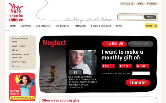
19. Action for Children
This website has an attention-grabbing, large and appealing call to
action area. This call to action area offsets the donation area
satisfactorily and efficiently pulls the reader to it.
20. MJFF
MJFF brings warm and inviting colors into play in order to engage
their readers. The color scheme works well and the gradient on the
actual donate button makes it stand out.
21. The Nature Conservancy
The Nature Conservancy uses a quite unusual approach for their
donation page. They placed two subtle calls under the header where users
are likely to expect the navigation to be.
22. Kiva
Kiva has a very simple, sleek donation page that focuses on several
routes to help users. The boldly colored call to action buttons are
truly attention grabbing.
23. Operation Warm
Here you will notice a nice, friendly color scheme that varies
throughout the page. Though the main calls to action mix together with a
majority of the site because they are the same color while the
secondary calls are a bit more obvious because they break from the blue.
24. Mozilla
Mozilla features a delicate donation page design with an innovative
header that accompanies their website. Their fans and users can donate
to keep their mission active.
25. Network for Good
Network for Good has got a fantastic design that possesses three
courses of action that their readers may pursue. Each of them holds a
large, attention-grabbing call to action button.
26. Virgin Money Giving
Here is a unique donation page that is divided into categories in
order for users to find the kind of charitable organization they are
seeking to support.
27. Planned Parenthood‘s
Here a form is used for the main appeal with more subtle calls placed
in the upper right corner. Overall the design is simple and effective
leading the reader into the ‘action center’.
28. World Food Programme
World Food Programme uses a very subtle design for their website with
an online form to help their users donate for their cause to keep it
alive.
29. Red
In this web design, you will see minimalism in a new style as this
donation page features overly large typographical elements that truly
work well to draw the users’ attention to the action areas.
30. Amnesty International
Amnesty International design of the donation page focuses the entire
attention on the obligatory mission and calls to the readers.
31. Dalit Freedom Network
Dalit Freedom Network uses a very natural and earthy color scheme
that works well with their mission along with eye catching and appealing
call to action buttons.
32. Take The Walk
The boldly colored call to action buttons in this design truly stand
out from the other donation page designs. The color scheme is also very
appealing.
33. Practical Family Living
Another excellent example of a subtle donation page design that works
very well for the mission. All the design elements are in perfect
balance making this design stand out.
34. Housing Works
What makes this design stand out is its excellent color contrast as
well as call to action button. Housing Works pushes their cause with an
extremely trendy and tempting donation page.
35. Children’s Rights
Children’s Rights donation page is designed by keeping the overall
design simple and clutter free. The call to action button is moderately
sized and positioned at the center of the page.
37. Project Rescue Foundation
In this web design, you will see a unique approach for designing
donation pages. An online form is also there to help you donate to their
cause.
38. Custodial Abuse
Here they use a large image to connect with their cause in a simple
but effective way as they are working for a very sensitive cause.
38. Memphis Zoo
This rather remarkable design for a donation page truly stands out
from the rest of the site due to its excellent and vividly colored calls
to action button.


No comments:
Post a Comment